Tuesday, October 4, 2016

Austin...my new boyfriend

I am a proud Northern Indiana born, Chicago raised & grown, snow shoveling, El riding, Midwestern hot dog eating Yankee chick. I never in my wildest dreams thought I would be living in Austin Texas and absolutely loving it. I don't do well in the heat, I get a little stabby when it's over 85 degrees. But so far so good...no casualties yet. Austin seems to be the love child (and yes, spirit animal) of Chicago and Bloomington, Indiana. Neighborhoody but a mini metropolis. 4,000 plus bars and restaurants that are scattered all over this city. A dizzying array of architecture in the neighborhoods and downtown. It's a big, crunchy, hippie, arty, hipster, punky, blue collar, techie Eden. I was a little apprehensive and skeptical, who wouldn't be...it's Texas for God's sake! I am happy to announce that it is everything I thought it wouldn't be and showing me it's true self. It's easy. I've been here a month so far, probably have met over one hundred people and almost every single one of them used the word "Welcome!" "Welcome to Austin!" or "Welcome to Texas!" are two of the other phrases used. One of my newly made friends even went so far as to add "We're glad you're here." I couldn't believe how genuine everyone is. People in Chicago don't say "Welcome". They say things like "Hey Jagoff! Stay in your own lane!" or "Excuse you." It's nice. It's all new to me. It feels good to relax a little. I think I'm gonna dig it here.

There's so many iconic and culturally cheeky stores, boutiques, galleries and bars. The murals on the sides of buildings has it's own category of graffiti. Perfect backdrops for selfies and group pics. The design and architectural elements to this town are amazing. Not narrow or pigeon holed at all.


Self-deprecating humor! (So far the map seems to be holding true)

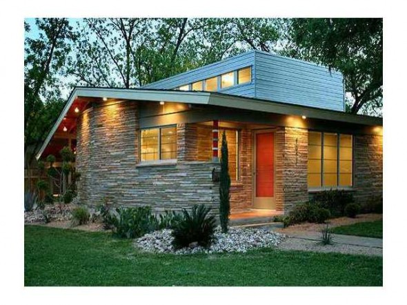
The town is awash in modern, midcentury modern and contemporary homes.

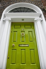
But there are plenty of turn of the century beauties. I wouldn't believe this photo is in Texas, so green and lush.


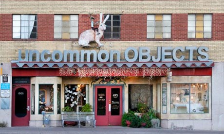
My favorite store! Antiques, taxidermy, Victorian madness, old jewelry, mid century objects...hours of fun!

I also now understand why Austinites are always muttering "glad you enjoyed your visit, now go home" under their breath (with a smile) when they meet a visitor who is so enamored with this town that they want to move to this incredible place. I get it. Too much growth too fast. I'll just keep apologizing to them for moving here. But I'm not sorry.



Sunday, October 5, 2014

My Body My House

I am 46 years old and have waited for twenty five plus years to make the anguishing decision of what and where my first tattoo will be. I know it sounds ridiculous but I'm finally near the plateau of my life and am no longer a pussy, able to make a physically altering (no going back) decision. I was always the only one in the room -back in the day- to NOT have a tattoo. I was okay with that. If everyone else was doing it, wearing it, saying it or listening to it, I didn't want anything to do with it. Now, I've heard the number of people with tattoos is pushing 40% of the population...hmph. Whatever, I have always loved them and have always found them incredibly intriguing.

I thought it would be an interesting challenge to find some interiors of rooms that translate to tattoos, at least my interpretation thereof. I'd like to pose a challenge to readers...if you have tattoos and want to show off your personal style, by all means, please send me some pics of you, your tats and your room(s). I'd love to see the personal style revealed in your house and on your skin.


Black, stark and graphic. A fitting description for most tattoos. This room is only brought back to earth by the vase of white tulips, without the organic touch, it becomes way too cold and impersonal. 


Color, personalized and a bit of tradition,,,always fill your home with what you love and you'll never be unhappy or bored. Hopefully, you can say the same of your tattoo for all your years.


I ADORE this wallpaper! Skulls are a cornerstone in tattoo design and what could be more appropriate for this post?! This is Anita Modha Custom Design Wallpapers out of Calgary. Proper- Punk Rock-Granny design. Brilliant.


This is Tobi Tobin's work. Genius. This pretty much sums up my design style. Traditional/creepy/dark/beautiful. She's been dubbed the Rock-n-Roll Martha Stewart. Fitting.


More Tobi Tobin. Again...dark, a little industrial, butch, beautiful lines with a little edge. Not too out there but definitely not for most of you. (Thank God)


Our love for animals runs deep and so many are incorporated as tattoos. Taxidermy is an amazing art form and I love the fact that so many people are not fans. 


Monday, July 30, 2012

Reclaim your room!

I hope to inspire with this blog and sometimes we have a room in our homes that needs a little inspiration and attention. Some of us aren't fortunate enough to have one of these rooms, others have contorted it into an office, playroom, studio or extra family room. Some of them are "a part" of another room (like mine), a run-on by lazy architects on a budget or builders who try to convince us that an open concept is best for all of us. Sorry architects and builders but I am talking about the formal Dining Room. A room unto it's self, separated from the kitchen, living and family rooms. Our insane and overly scheduled lives have left the dining room to a mere pass through or left waiting for the Big Three (Thanksgiving, Christmas and Easter) to open it's arms to us again, welcoming us back like the Grandmother you don't visit enough but she's always happy to see you without a lecture.

I spent many years working (and drinking )in restaurants and bars. The sense of community and comfort are the core of the concept...being with other human beings, communicating and sharing food, drink and ideas is a basic need in our lives. So why would you allow that same need to go unfilled in your own home? Home is the last safe place on earth, it needs to be as comfortable and inviting as possible. Sharing ideas, communicating with the ones you love and providing that safe haven for your family is essential to a happy life. I can refer you to all kinds of studies that tell us that eating dinner together as a family brings us all closer, helps our kids get better grades, raises their self esteem and in general makes you a tighter clan. But we all know these benefits of dining together and eating in front of the TV as a family does not count!

Let's get some inspiration from a teeny handful of cafes, pubs and restaurants from around the world...


I usually have to comment on all my pictures that I post but I will let them speak for themselves this time.

I know you can't see the interior here but I had to include at least one outdoor cafe shot and I can't help myself when it comes to Cafe du Monde. It is one of my favorite spots in New Orleans. Yes, I know it's tourist Hell but just look at this picture, it makes me smile. Gorging yourself on a pastry with an astonishingly high calorie count, drinking cup after cup of coffee till you're shaking, chain smoking till you've filled the ashtray and watching the freak show of tourists, junkies, musicians and locals shuffle by was one of my favorite and most memorable experiences (besides the bars and graveyards - which we will cover another time) in New Orleans.

Go on now...go clean out your dining room or carve out a space in your home for one and bond with your family or better yet, host a dinner party!

Friday, July 20, 2012

In the Navy!

I'm pretty sure I am now mature enough to fully embrace the color Navy. I think there are some colors in the spectrum that you grow in and out of and some you have to have enough wisdom to fully appreciate. It is a quiet color with lots of muscle, the strong silent type, it has as much tradition as it's military namesake and it makes me feel (just a teeny tiny bit) like a Kennedy back in the early sixties.


Powder rooms are the best rooms in your home to experiment with the dark, the intense and the glossy, three of my favorite things. This beautiful sink looks like a starlet under the spotlights. Gorgeous!


Here we go...Mary McDonald is one of my favorite designers. Her punches of graphic patterns and colors, especially on floors, is always the room maker. It's her signature style and it once again proves that the floor (and ceiling) are just as important as the walls. This pattern is so over-scaled it's almost comedic, that's why it's so amazing. I'm forgetting how beautiful the rest of the room is but that's a no brainer.


This flame patterned wallpaper is another wonderful graphic punch that makes the room. The white and orange jump out and give just the right amount of contrast to make this room really pop. The navy, white and green color combo also totally remind me of the early eighties at Catholic school...you know, Izods, Sperrys and cardigans.


This room is so freaking fantastic that I posted it on my Facebook page this week. Chartreuse is my favorite color and the contrast it provides in this room breathes a little modernity into an otherwise stuffy room, although it is saved from that fate by the sexy high gloss walls.

I think I'll paint our powder room this weekend...high gloss navy I think.

Friday, July 6, 2012

Men...why so apathetic?

I love men. I especially love my husband of seventeen years. I also love gay men. Here is where I'm going with this..are (hetero) men really interested in interior design? Of course the answer is yes but what percentage? And why is the percentage so high with gay men? What is it about interiors that repels the average man? Is it some crazy chemical imbalance? It's not an uber girly genre. These are spaces that we all spend time in. Do you not care if your living room sofa is leather or mohair? Are you that lackadaisical to the palette of the Turkish rug? If you don't care then I guess I'll just go ahead and recover your Dad's wing back in a modern floral. Oh...now I have your attention, sir.


I wish men were not so apathetic about such an important part of their lives. A while back I did an entry about pairing up smoking hot men with equally handsome rooms, one of my favorite entries. I definitely have more of a masculine lean when it comes to design so I'm on your side dudes! Next time your wife/girlfriend/partner asks your opinion about your interior space, give an opinion. You may not get your way but at least you've contributed. Take pride in your home, you spend a lot of time there and it's one of the last safe places out there.


Sooo butch! See, isn't this fun?


See, not all pictures and wall hangings have to consist of flowers.


So next time you've been drug out to a furniture store or (gasp) an antique store by your better half, please try to at least act like you're interested and answer her questions with more than grunts and shoulder shrugs. It will make her so happy if you at least just point to one of the pillows she's holding up for your approval. I guarantee she won't choose the one you pointed to but at least you're engaged in the outing. If you are on good behavior most of the day you may even get lucky that night.

Thursday, July 5, 2012

Saddle shoes and no seat belts

My husband and I saw Moonrise Kingdom last night and once again Mr. Anderson, thank you from the bottom of my heart. Wes Anderson is the director of one of my all time favs (#3 on my top ten list, The Royal Tenenbaums. I even recommend watching it without the sound.) The scenes, sets and wardrobes are an emotional journey for me and I'm sure most of my readers...at least those of you over the age of 37ish. The knee socks, the record players, the oriental rugs, the board-game closets, the chain smoking, the metal can of Wilson tennis balls (you can still smell them as you take the lid off can't you?) and the absence of seat belts in cars. His movies allow me to relive a period of my life that I cherish and yet makes me sad that my own children will never feel and experience all of the amazing, dangerous and naive opportunities that I had.

My children are at camp this week in Michigan, hopefully gaining as much worldly experience as all the children in Moonrise Kingdom did in their camp adventures. One of the first things we're going to do when they get back is to go see this film. Hopefully, it will give them a little insight into my mumbled words of "the old days".


I loved and adored my saddle shoes.

Again...styling is genius and so spot on.

Thursday, June 28, 2012

M.I.A. no more

Wow. Three months? Unbelievable. Okay, back on the horse. I've been really uninspired and a little overwhelmed with my day to day duties to my family. I've reorganized, pulled up the proverbial boot straps and am ready to kick ass again.

Where shall we start?

I am ready to "phone up". Do I really need an I Phone? I don't want one just because so many of you have one. Sorry, no offense but if everyone has something or is doing the same thing, I don't want anything to do with it. But the phone covers are so cool. How about a little feedback, pros and cons and recommendations?

I will resume the good stuff tomorrow...

Saturday, March 3, 2012

Pop goes Spring!

Everyone babbles on for weeks at a time at this point in the year about Spring. The colors, the temperature, the flowers, the renewal and all things pastel. I will insert my Spring inspiration here and allow you to get back to the REAL task at hand every Spring...home improvements!

Paint your front door...today. It's easy, inexpensive, adds instant curb appeal, brings a much needed pop (most likely) to your exterior, it's a great return on your miniscule investment and (the bast part) it's instant gratification!


Wow...see what I'm talking about? Tangerine Tango is Pantone's 2012 colour of the year. They set the tone for the design industry, they know what they're talking about. Trust them ~and me.


This is gorgeous. Popping out against the white trim with the gleaming hardware, you could stop traffic with this. Notice the high gloss paint, too. Don't be afraid of that finish. Ignore the novice advice of the twenty-something guy at the hardware store in the paint department.


Another lovely, bright and slightly retro color. Reminds me of Geraniums. Super girly.


Okay, the doors here are incredible on their own but the color makes it. You could easily use it, too. Upgrade the hardware while you're at it.


I thought these flowers pretty much sum it all up. So much inspiration in one vase.


And finally, here is the color chart from Pantone. Interesting choices. They chose the Tangerine to energize and revitalize the weary consumers of our country. Hope it works because I think we've all had enough. Here's to a Revitalized and Energized Spring! ~raise your glass~

Wednesday, February 8, 2012

Scotch on the rocks please, I'm starving.

One of the most glamorous, chic, urbane and well rounded pieces you can have in your home ~if applicable, I understand this is not for everyone but if you're a regular here on Zoe, this is applicable to you~. I love the bar cart. It can be a table, a buffet, a nightstand, anything that has a solid surface and looks fabulous. I was at a client's house today and she had a sweet little silver tray (with a lip) and had just three bottles of liquor with two beautiful cut crystal glasses on it and it sat on her buffet. Not super fussy but you got the jist, they enjoyed a drink a few nights a week and this is where the magic happens.

A well stocked and well rounded bar consists of the simple necessities...vodka, gin, rum, whiskey, scotch, seltzer, soda, sweet and dry vermouths, a few mixers, a few lemons and limes and you're there. Obviously the appropriate glassware, too but don't go kooky. A few rocks glasses and a few highballs will do the trick. Keep the wine glasses and champagne flutes with the wine in a separate locale. The hard stuff stays on the cart, wine stays in the kitchen.


Beautiful, simple and they even managed to find room on there for a lovely table lamp.


Really simple and old school.


Please! Someone fill this cart up immediately with some booze!


Gorgeous! Love the color. It's a little utilitarian but it's femmed up with the blue paint job.


Love the symmetry of it all. Pretty sure this is an inexpensive book case all dolled up and ready to party. Bet you have one somewhere in your house right now that you aren't even using really. Go get it, organize some booze and glass ware on it and call your friends!


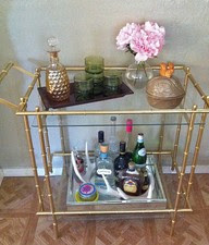
Love how uber girly this one is, the gold Asian look is working. I especially love the antlers.


Of course it would be sensible if you're doing any remodeling to consider beverage storage to your plans. We added a beverage fridge (wine fridge) to our kitchen remodeling under the ruse that it was for our children...their yogurts, juice boxes and fruits. It quickly turned into our overflow fridge for leftover beers from parties. A wise investment, purposeful and it looks fantastic.

Now go fix mommy a drink sweetie dahling...

Sunday, February 5, 2012

Greekster Baby!

It has been two long years since we have celebrated Greek Easter properly. It has been a tough couple of years for us as a family and I feel like we're back on track. A feeling of fresh starts, renewals and putting the past behind us. It's what Easter is all about, rebirth and renewal. This year we have decided to revive Greekster...drinking beginning at 9am, more Greek food than anyone should have and the sweet smell of spring as the lamb rotates on the spit. I've got two months to prepare, should be enough time.


Yep, head and all.


The consumption of this is after dark.


Dying the red eggs is labor intensive and a potentially catastrophic mess but they're gorgeous and fun for the kids to crack later.


The Icons are so beautiful. We received so many for our wedding but I wish we had more.